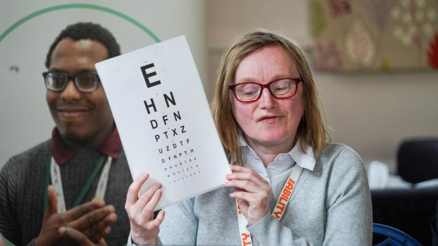
How we've improved our website for accessibility
Accessibility is extremely important to us. Digital accessibility is about making sure our website and the documents on it meet UK Government guidelines, so that everyone is able to use them. This includes making sure the colours we use have enough contrast for people with vision impairments, formatting our documents so they can be used with screen readers and providing content in an easy read format.
To help make our website more accessible, we have added lots of new features.
We worked with our Eye Care Champions and Associates, who have lived experience, to make sure the changes we were making actually made the website easier to use.
Here are some of the changes we've made:
Brand colours
We've updated the orange in our brand colours to be darker, which means it's more accessible. It may look like a small change, but it means the website and our resources will be easier to read for people with vision impairments! You may still see our old orange on some resources, but we're working to update these as soon as possible.
Resource library
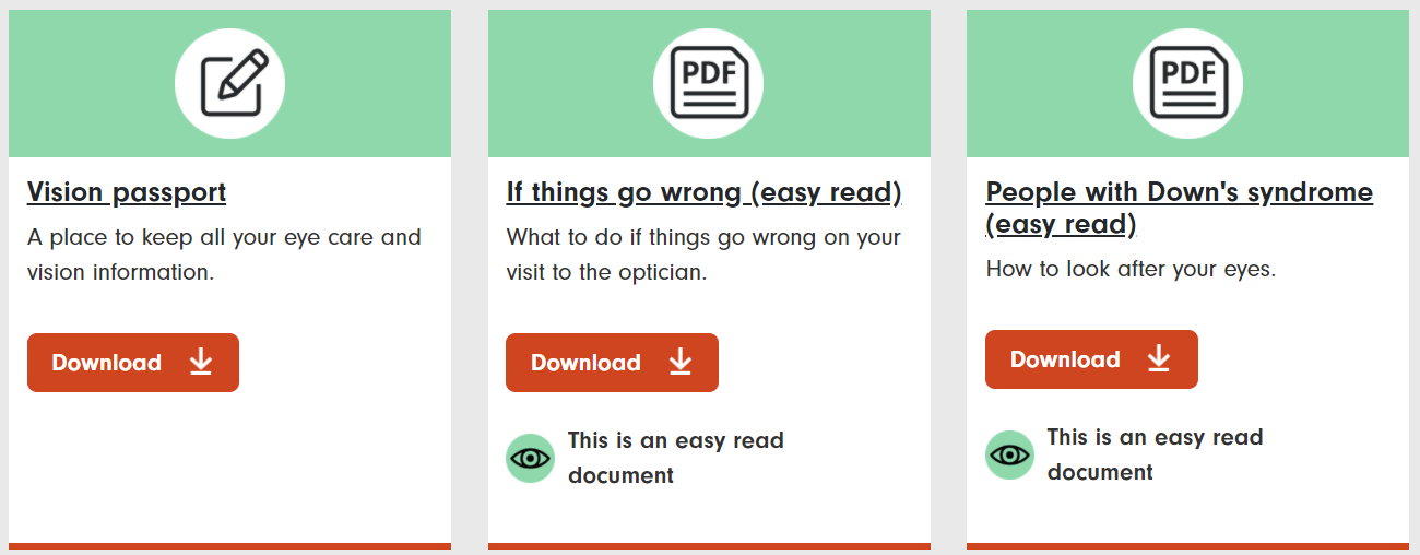
Something we’re really excited about is our new resource library, which showcases our valuable guides and forms. You can search and filter the resources to find what you are looking for, from eye care to supported employment, and even tick a box to just show you easy read resources. View the resource library.
Easy read online
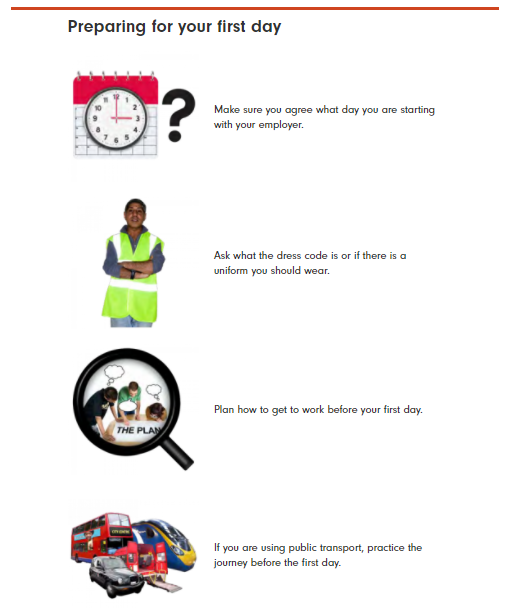
Easy read is where you present text in a way that is easy to understand, with large text and simple images. This is especially important for people with learning disabilities, so they can have access to the same information as everyone else.
With our groundbreaking new design, you are now able to read our easy read documents on the website, instead of downloading a PDF. The pages are laid out in the traditional easy read format and we hope this will be really useful for users of our website. You can see an example of easy read online here.
Optometrist and support searches
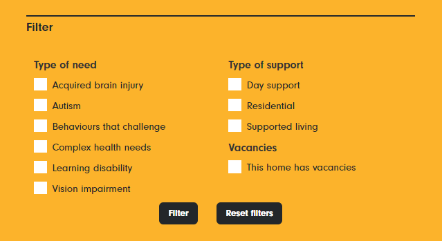
We’ve improved the way you search on our optometrist database and our homes and support map pages. They’re now much easier to use if you have a visual impairment and using a screen reader. We’ve also added filters, so you can find a specific place to support your needs much more easily.
There are also lots of improvements in the way the website was built for screen reader users that you can't see. We're going to continue to improve our website and resources for accessibility. If you have any questions or feedback about the new website features, please contact us at media@seeability.org.


